NOTE: This project was preliminary and exploratory, starting back in 2020. I am thrilled to have been a part of this process but I did not design the final brand.
Go check out what the brand ended up becoming here!
(and if you’re local, go grab a beer!)
===
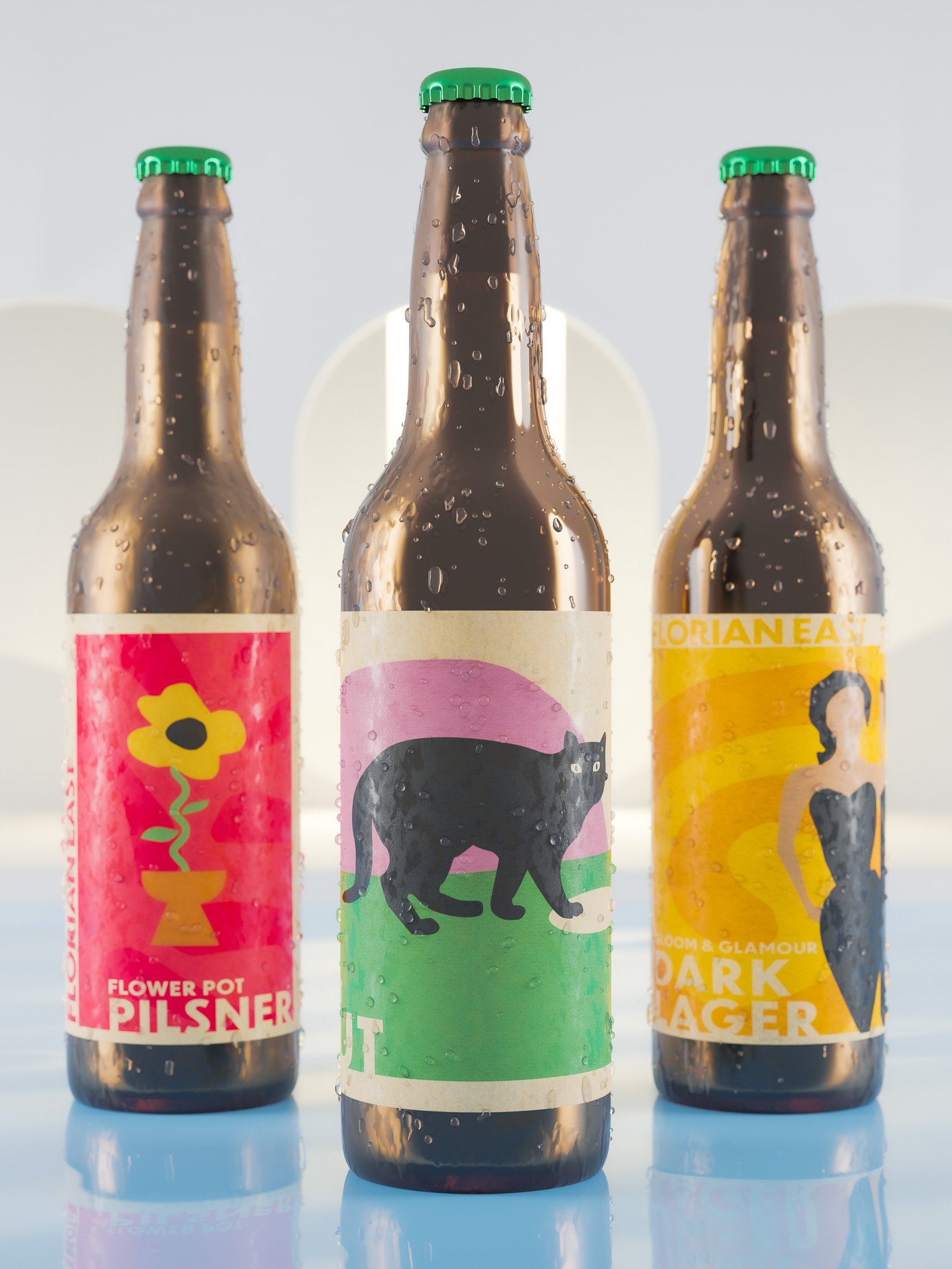
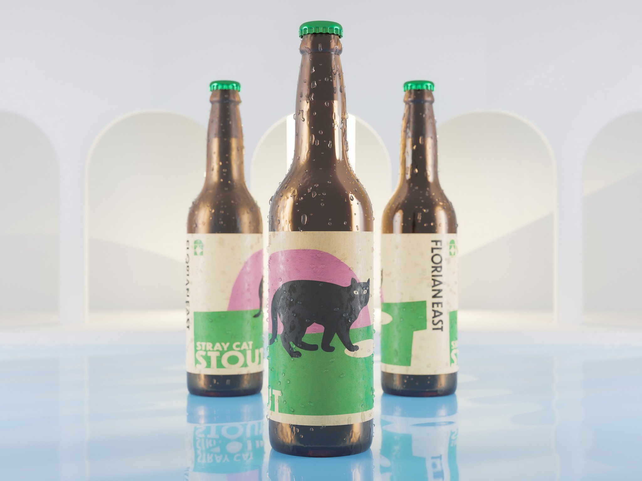
The brand language of Florian East Brewery Concept is characterized by simplistic scenes depicted in construction paper cutouts, creating a charming and simple visual aesthetic.
Inspired by the art of Polish poster design, Florian East embraces a minimalist approach that employs the tactile qualities of construction paper cutouts. This unique artistic technique adds depth and texture to the brand's visuals, evoking a feeling of authenticity and handmade craftsmanship.
Florian East's use of construction paper cutouts underscores its commitment to preserving a childlike wonder and joy. It communicates a sense of approachability, inviting consumers to join the brewery on a journey of shared experiences and memorable moments.
additional materials below
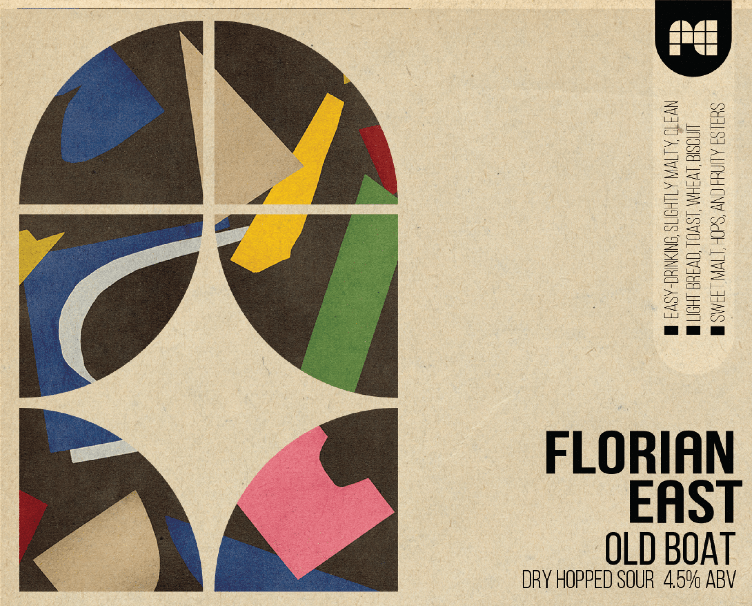
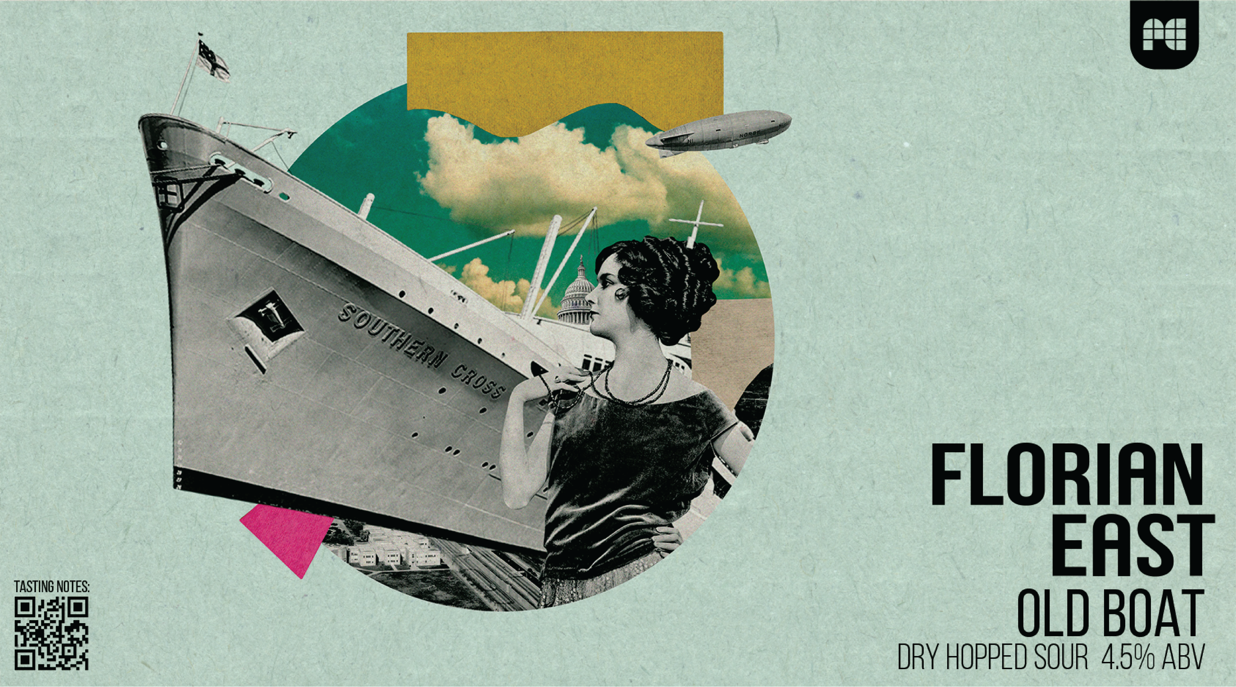
here’s some bonus stuff we didn’t go with. felt like a waste to just throw it out
enjoy :)


