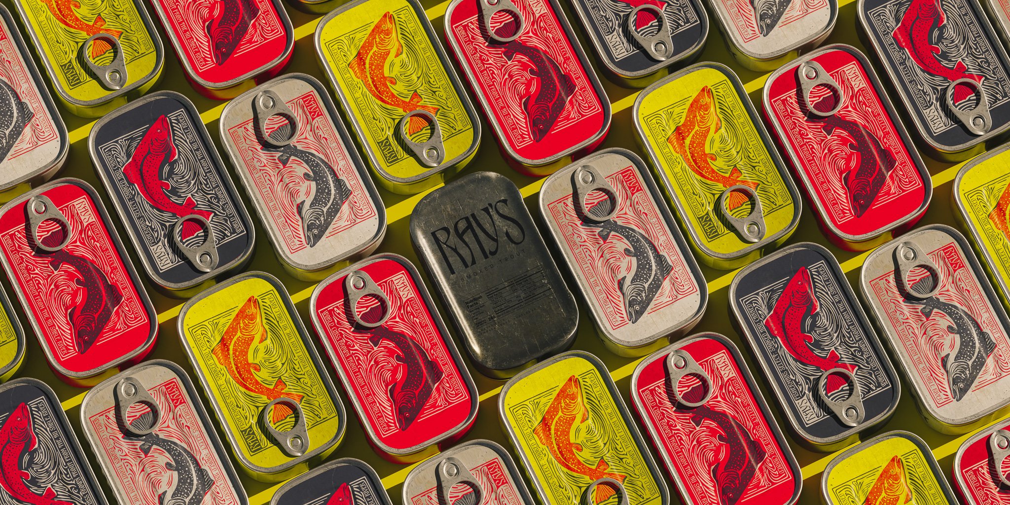
The goal for Ray's Fillets was to craft a brand that blends the charm of an old-world European tradition with small-town America through craftsmanship.
At its core, this brand is a tribute to the age-old tradition of smoking and preserving fish, infused with a touch of high-low aesthetics— wrapping a tin of fish in an art-nouveau themed packaging that references woodblock printing, the drawings of Arthur Mackmurdo, and the flowing lines of fat in the meat itself.
From the initial ideation to the final execution, I conceptualized every aspect of the brand. I not only designed the graphics but also brought the packaging to life through 3D modeling and animation, resulting in a cohesive and visually engaging brand identity that truly embodies the essence of Ray's Fillets.

The concept revolves around encapsulating the highest quality ingredients within an unassuming and humble exterior, much like the hidden gem of a small town.


